Paderborn University (GE)
Digitale Ausstellung
2022
Daniel Rother Studio (GE)
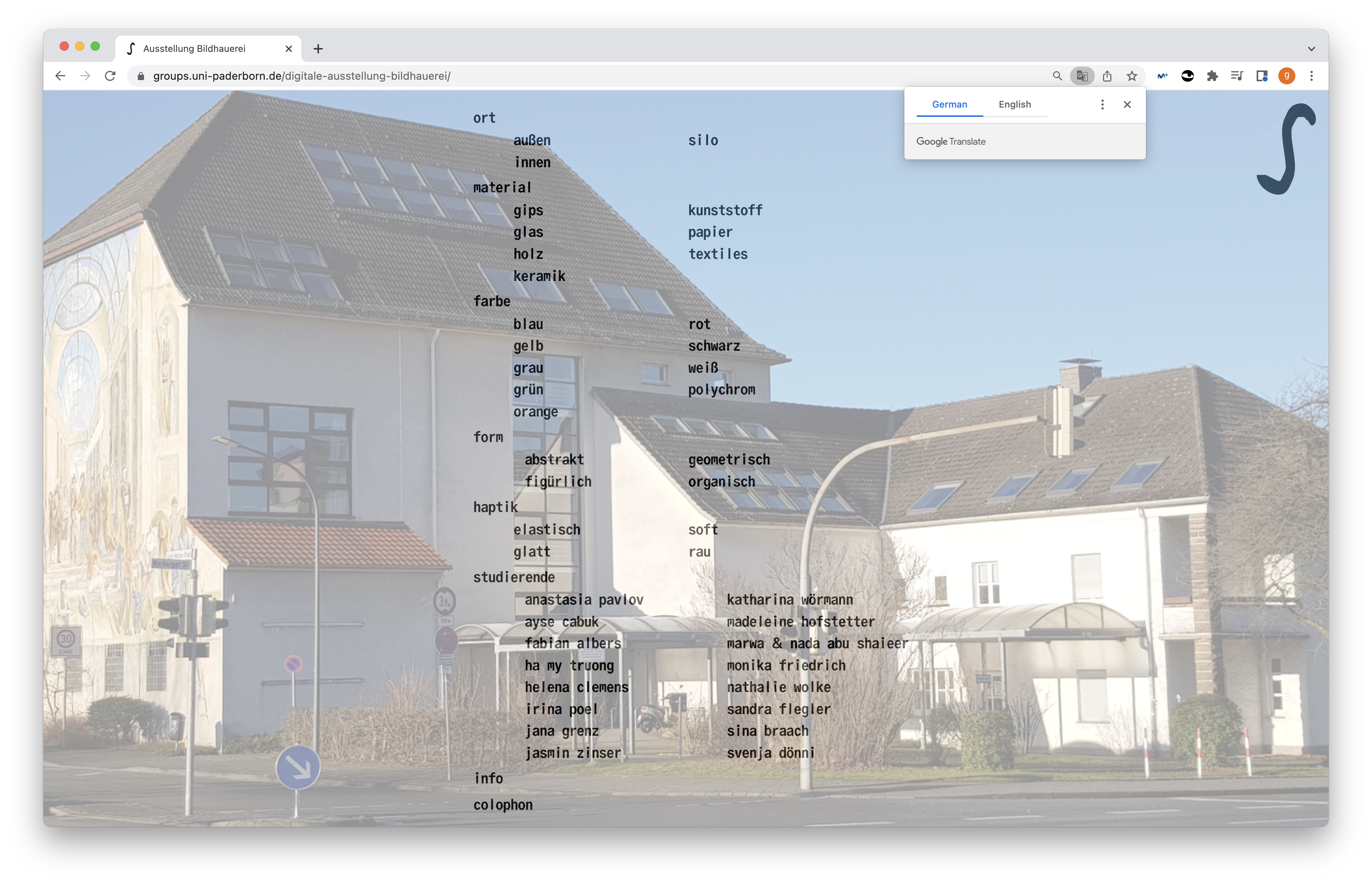
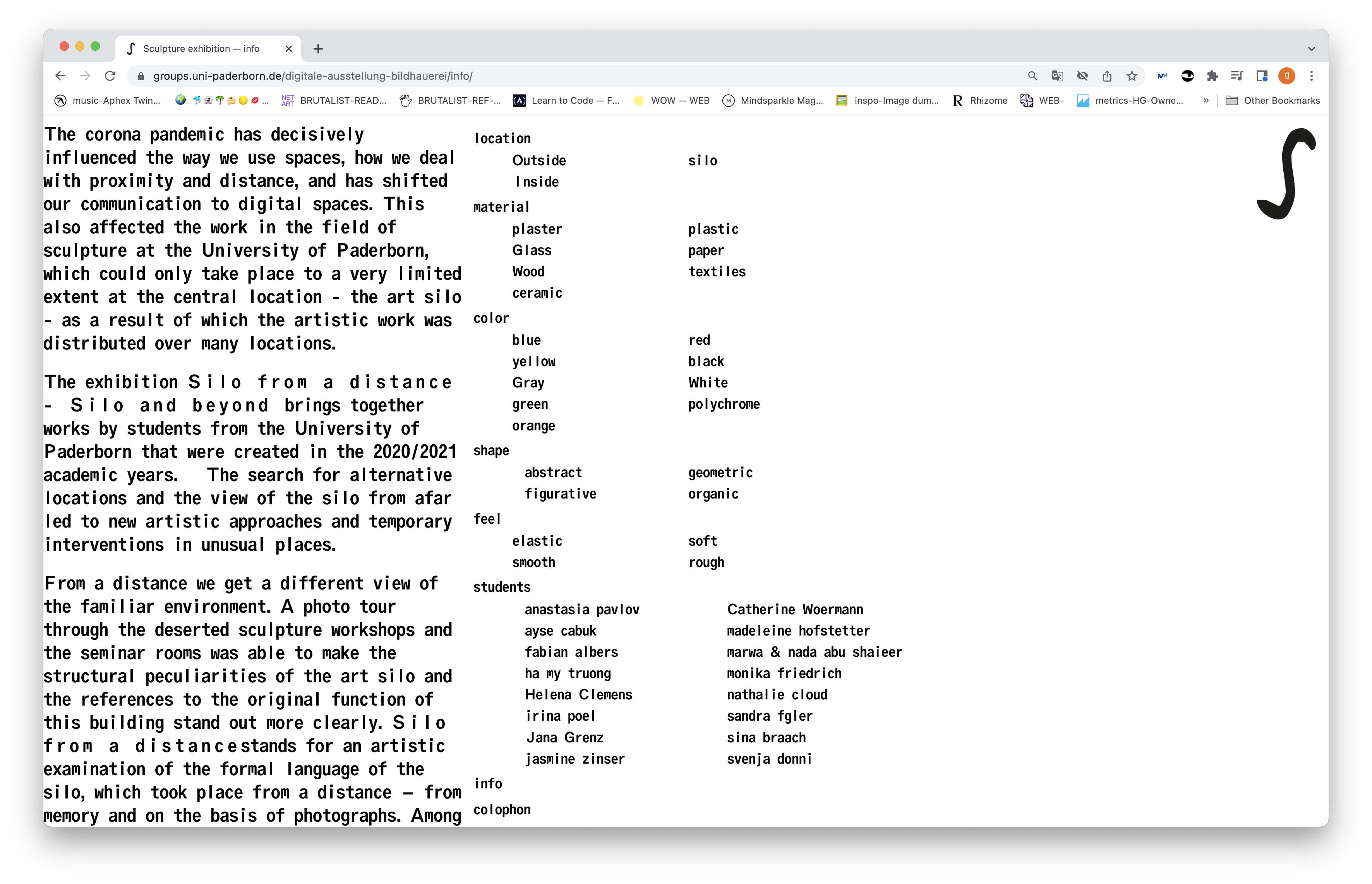
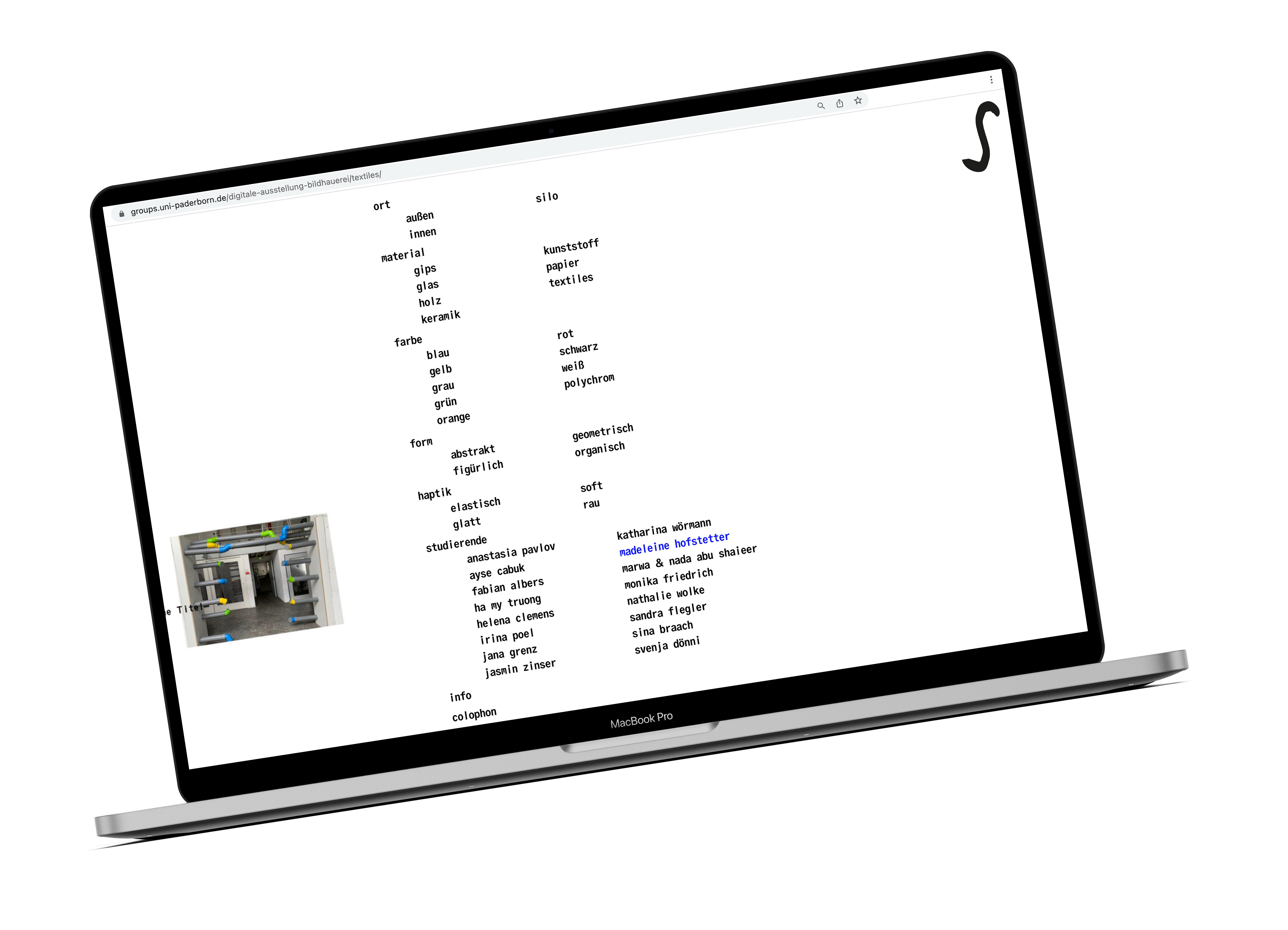
How can we understand the works and the exhibition from a digital interface where mobility is low?
Graphic design
custom code
website design
art direction
Paderborn University is a modern research and educational institution in Ostwestfalen-Lippe (East Westphalia-Lippe), one of the major economic regions in Germany. With an innovative mindset and a commitment to freedom, democracy, and social values, they are heading for a bright future by offering a wide range of opportunities to break new ground and contribute to societal progress.
As part of Daniel Rother’s Studio we were commissioned to design and develop a website for the Sculpture/Molding Techniques Studio led by Prof. Dr. Karina Pauls. The briefing was clear enough: to design a website that would serve as a digital window for the students who—due to COVID–19,— weren’t able to present their final sculptural projects.

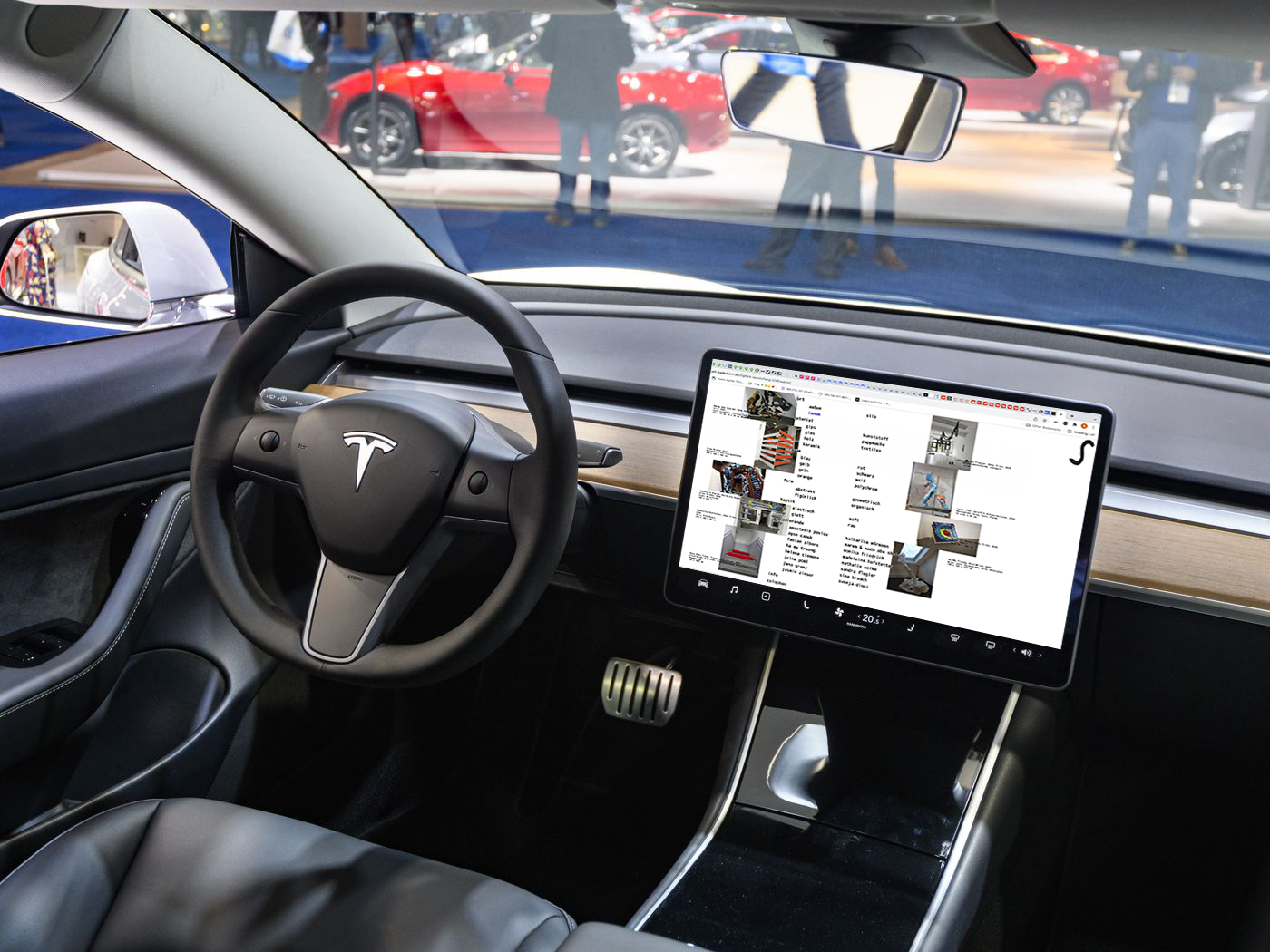
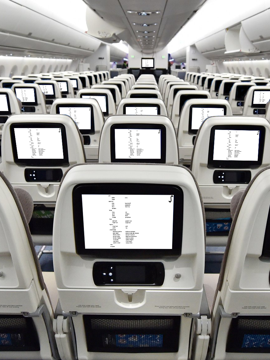
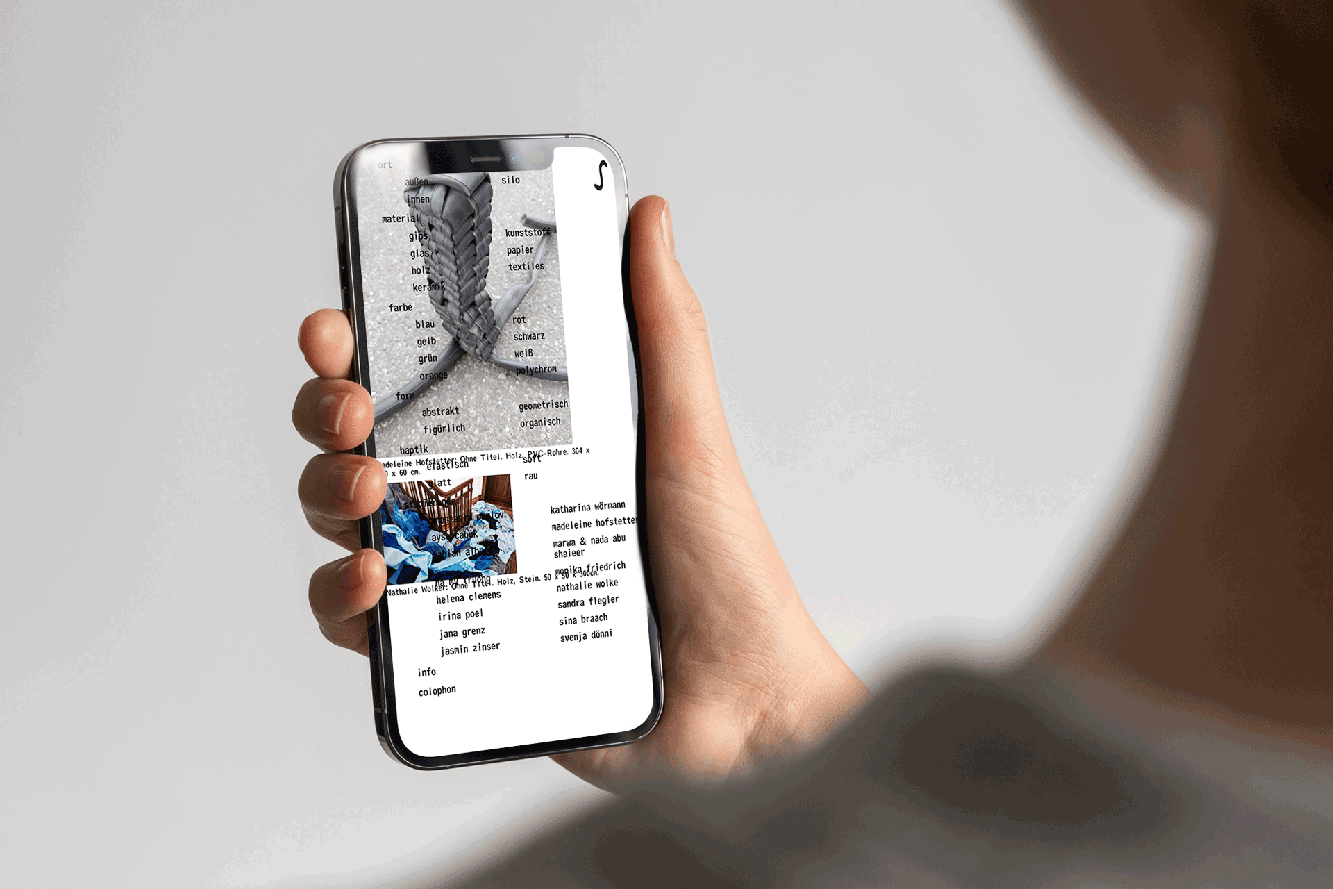
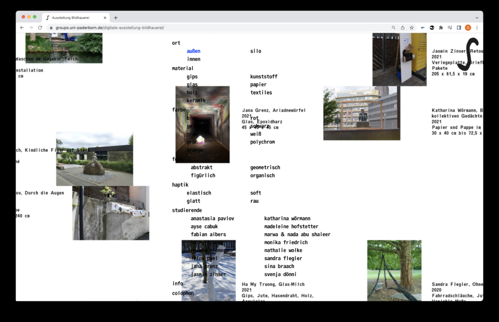
A monospaced typeface with unusual tracking was chosen to pay homage to the Silo’s architecture and contribute to the subject of matter as it pictures each word as a little sculpture of its own.
We kicked off this project by asking ourselves “How can we understand the works and the exhibition from a digital interface where mobility is low?” We came up with the idea that instead of showcasing all the work together, we would rather focus on the personal discovery of each visitor, mimicking the experience of getting to know an exhibition and creating a new perspective on how to visit a virtual exhibition.
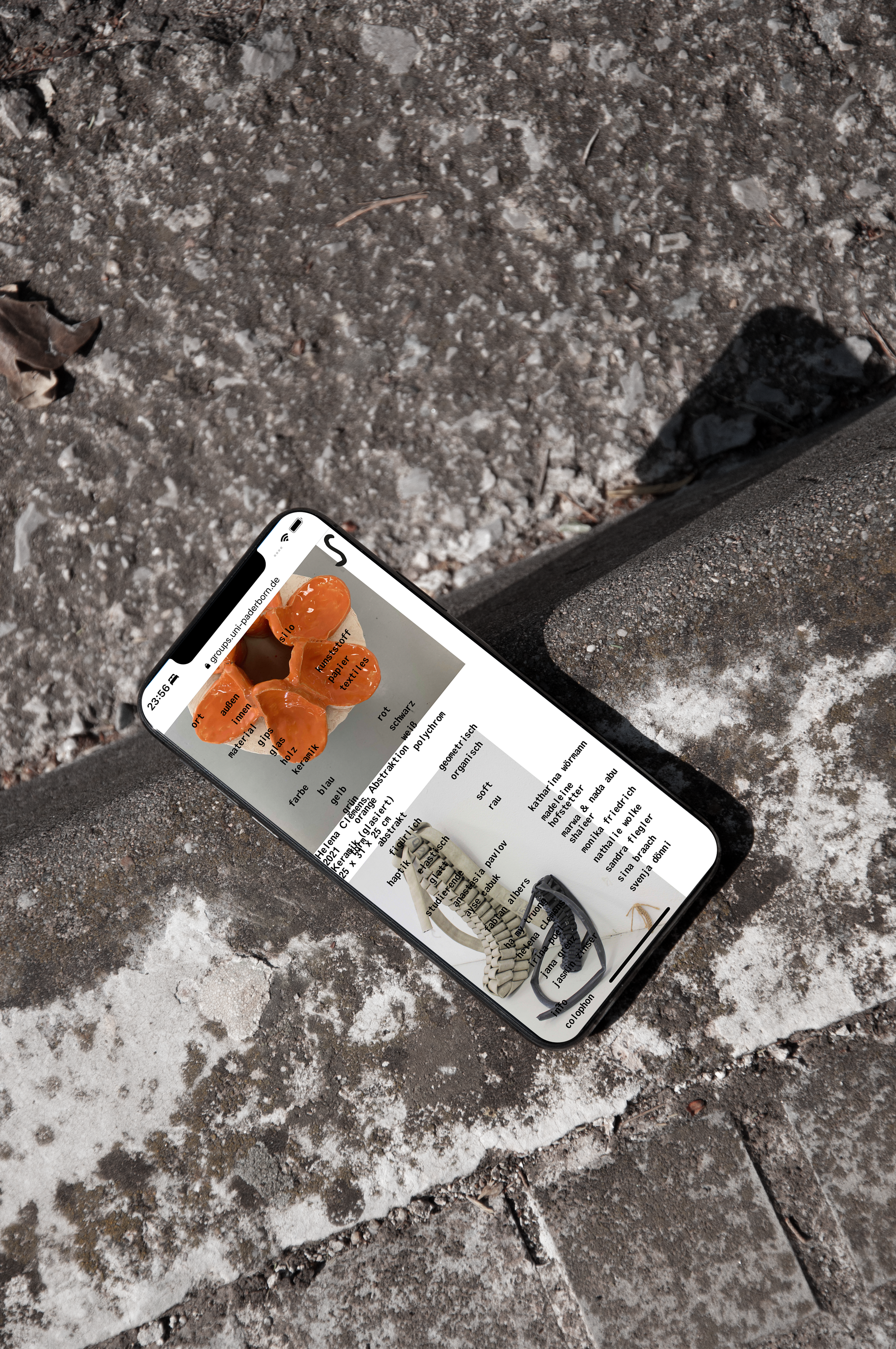
In order to reflect on the students’ approach to sculpture (which was one of the main things that were said during the preliminary meetings with Dr. Karina Pauls) we decided to ask students for words that they used to define their sculpture’s physicality. These words were then used to create the website’s menu, a spinal chord that would enable mainly two things: discover the artworks through the students’ perceptions and open up a debate about the concept of an art piece though the tension created on its overlapping with the images. The overlapping of the menu with the artworks works as a way to underpin the Silo’s architecture and translate the digital canvas into human sense and imagery.
Together with Daniel we developed the concept and designed the website. I was then in charge of the custom code for the website and development, as well as the art direction.
