Weincontro
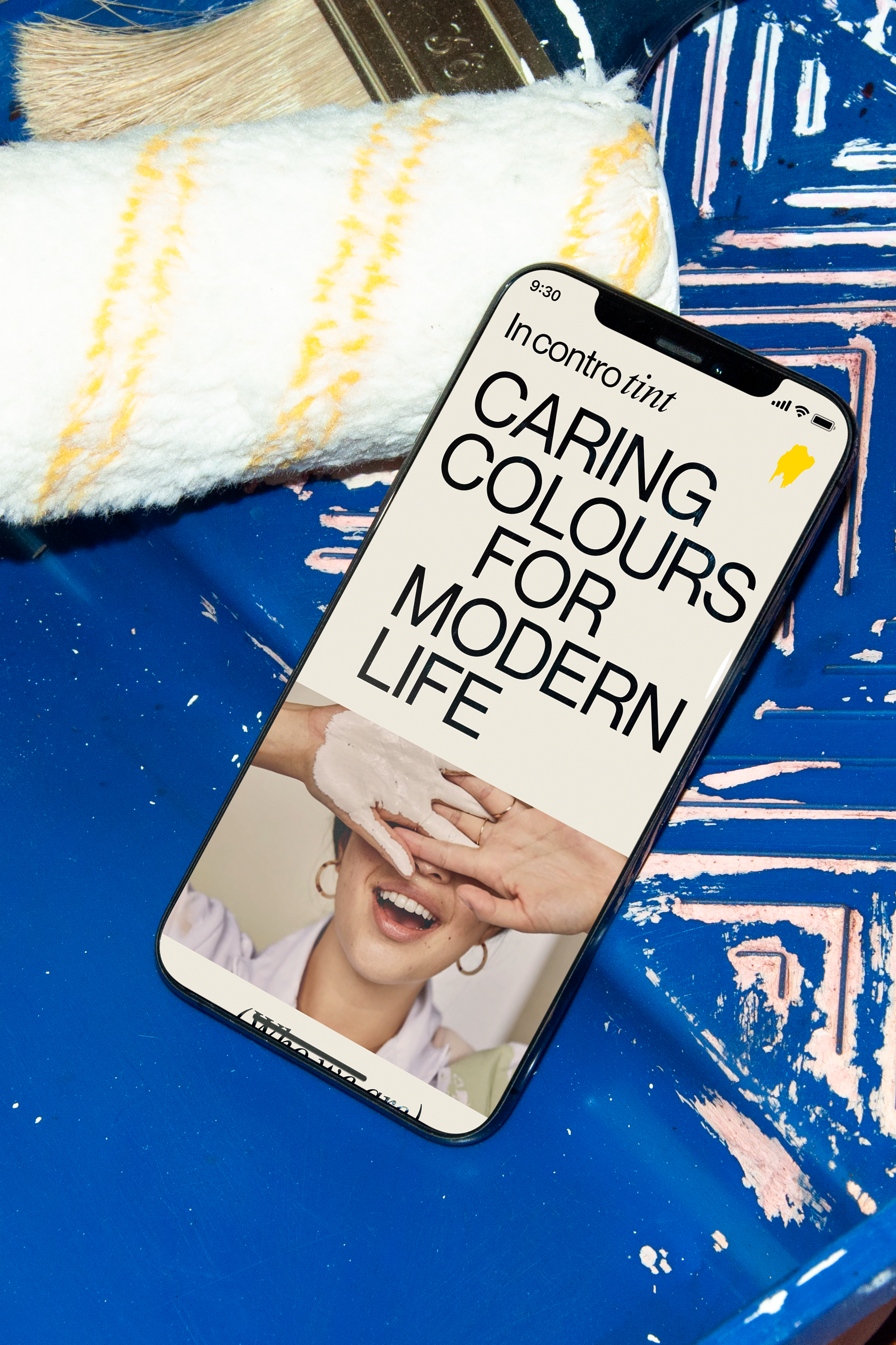
To bring sustainable paints to the market and expand a new and reassured audience.
Creative direction
communication design
photography
UX/UI
motion
I presented a proposal to Weincontro’s studio in order to present myself as an active freelance collaborator.
The challenge was to create a homepage for a hypothetical company called In contro tint and to design coherent visuals and graphics for the website that reflected on the brand’s values and engage the user.
The logotype was already designed so I started by doing a competitive market research to position In contro tint within. I then went through sketching and color tests.
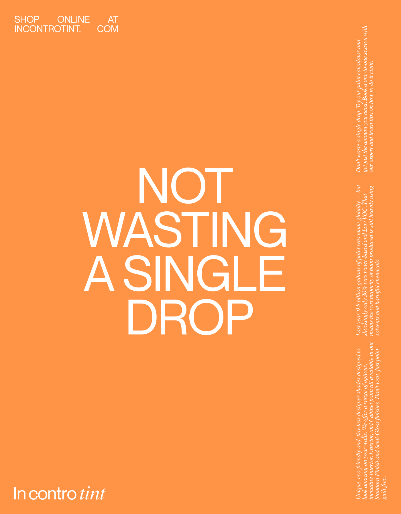
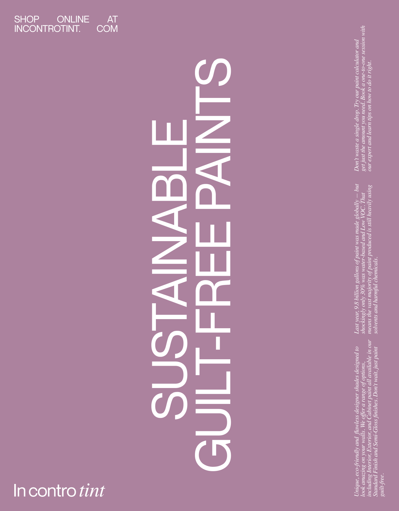
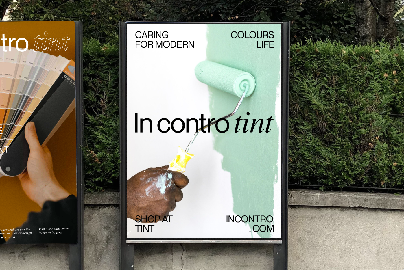


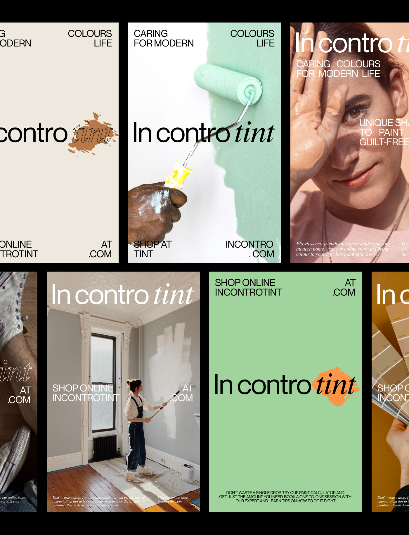
Inspired by the slogans “old meets new” and “learning by doing” the identity delivers a joyful and contrasting mix that is seen throughout the visuals, photography and layouts.
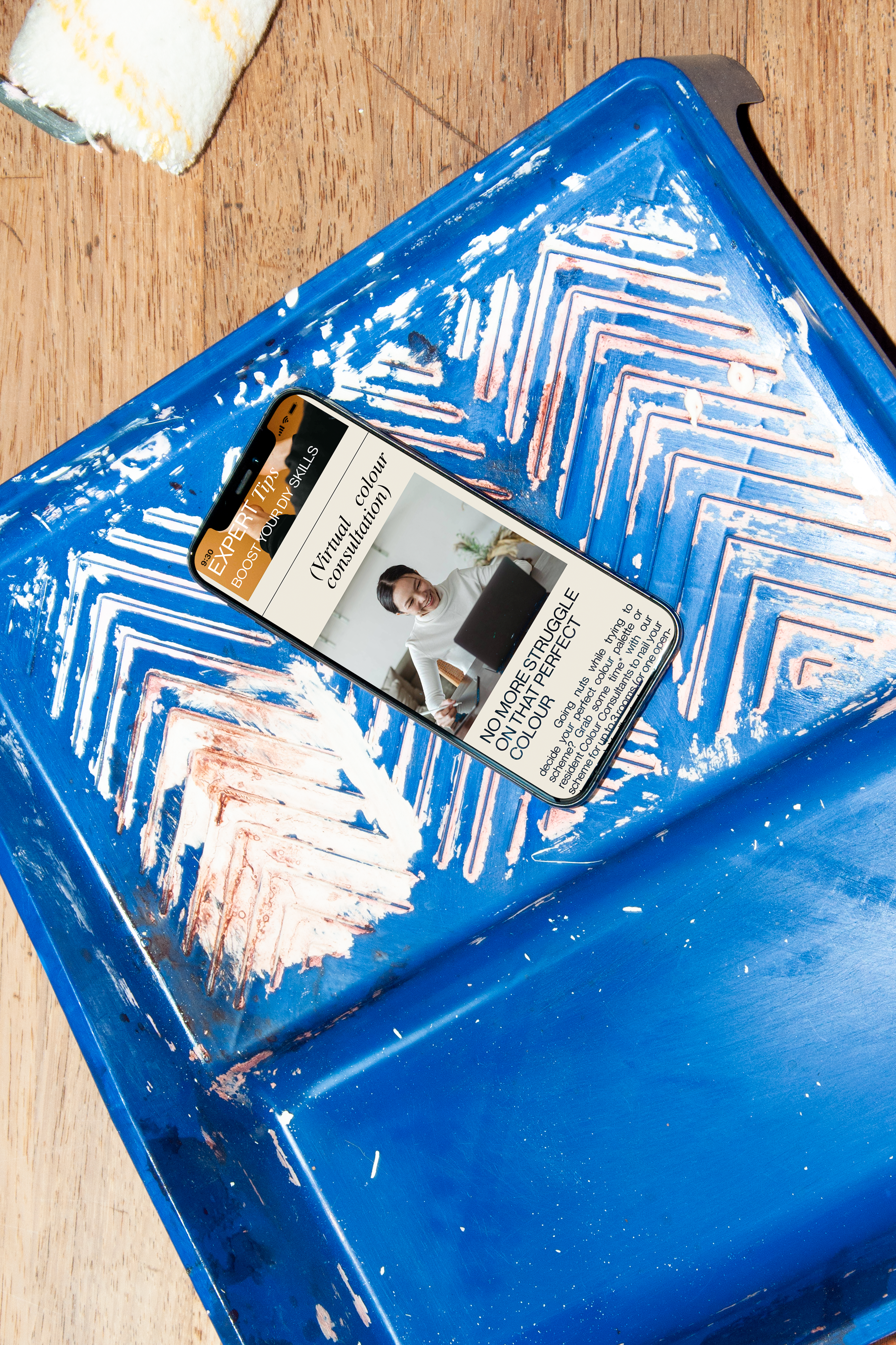
To give the user full potential and embrace the DIY philosophy, the user has a full on experience on the website and social media channels: buying the right amount of paint, learning personalized tips on how to do it right, and visualizing their projects beforehand.
In the website there are two main features: colour assessment and a paint calculator, as well as the product’s full catalog.
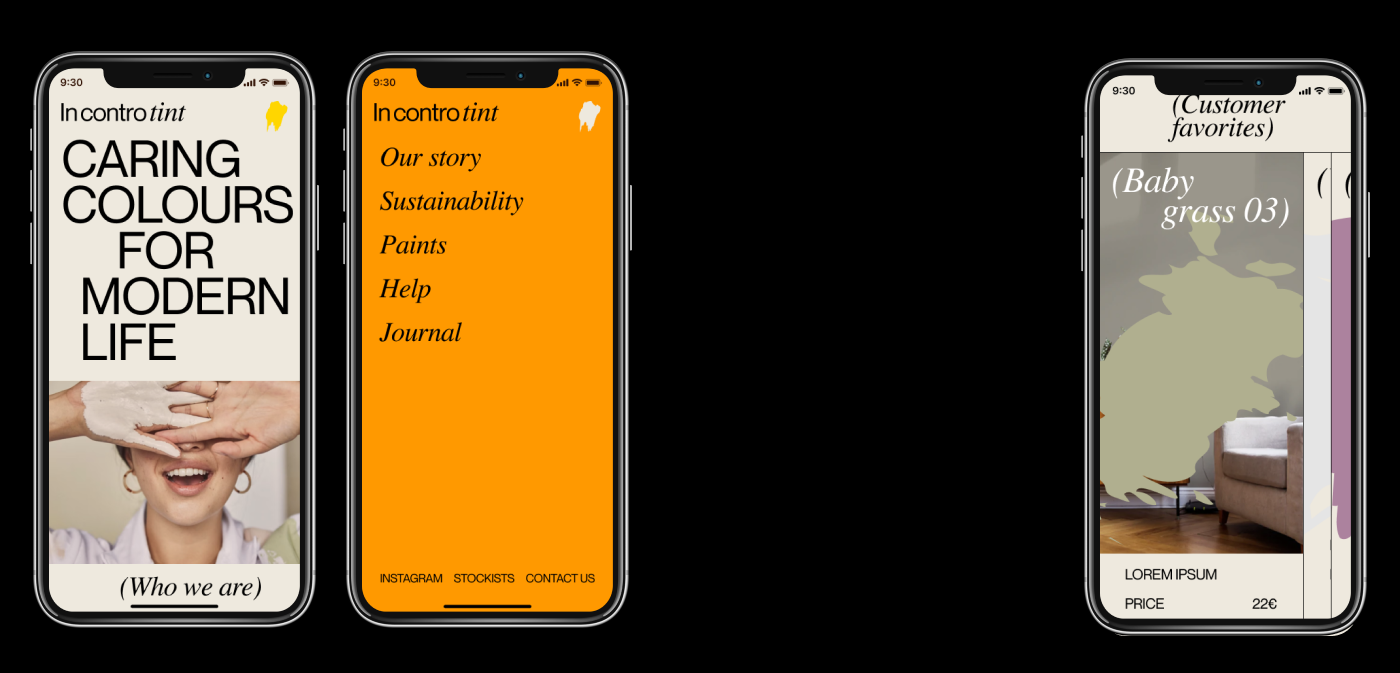

A sleek typeface combined with modern layouts give the right amount of breathing space which make the colors shine at their best.
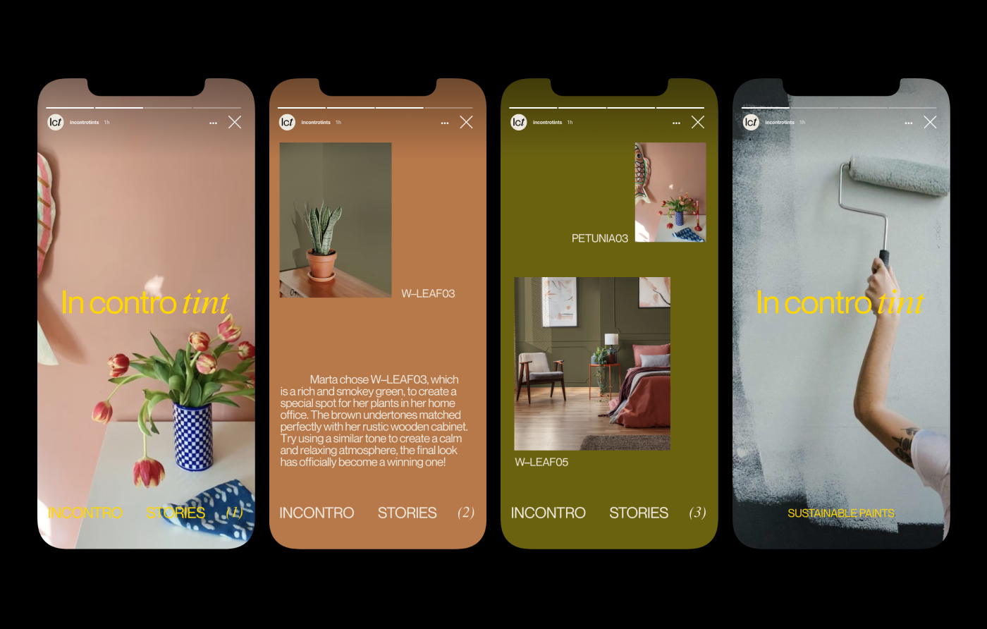
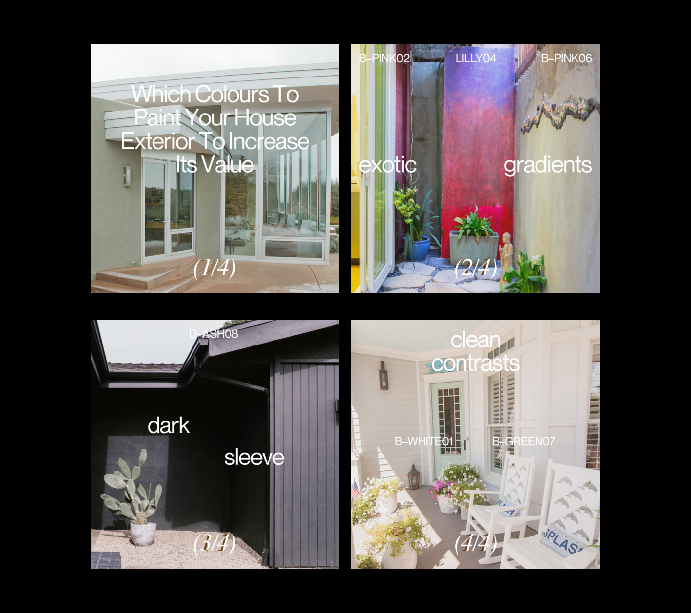
Social media was key to the communication strategy. Through content narratives and storytelling it builds a strong connection with the potential customers. For instance, Instagram stories and posts are organized within 4 categories (news, tips, stories, impact), each of them featuring either new products, real tips, customers’ projects and brand values, as well as the social and environmental impact of the brand’s products.
