2022 – 2023
Rebranding of Fredcolor’s identity, website and communication strategy.
Creative direction
Communication strategy
content
branding
UX/UI
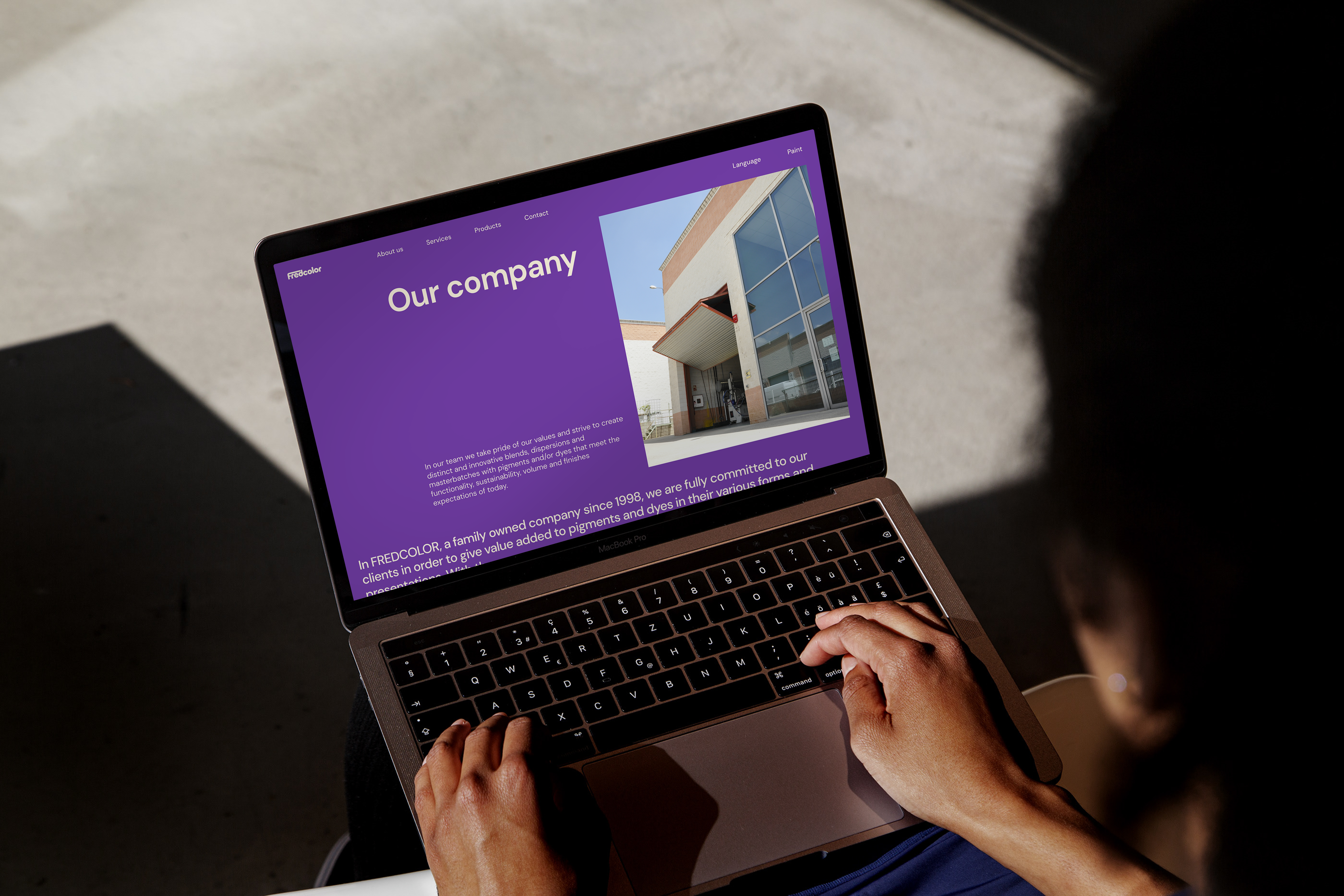
Fredcolor S.L. is a mid-size family company that strives to create distinct and innovative blends, dispersions and masterbatches with pigments and/or dyes that meet the functionality, sustainability, volume and finishes expectations of their clients. Fredcolor specialises in custom color development and production.
The main goals of this project were to pinpoint Fredcolor’s competitive advantage among competitors, to create awareness of the brand redefine and acquire new international clientele, to define its communication strategy and tone of voice, and to update the website’s hosting and enable a CMS.
The process started by conducting in-depth research into Fredcolor’s products, brand perspective, and market positioning. I ran performance tests on their website, analyzed their social platforms to identify key pain points, and carried out a competitive analysis to understand the broader industry landscape.
To gain deeper insights, I led primary research interviews, speaking with employees and the founders to extract valuable perspectives. This process helped me refine audience segmentation and develop a clearer understanding of the company’s identity.
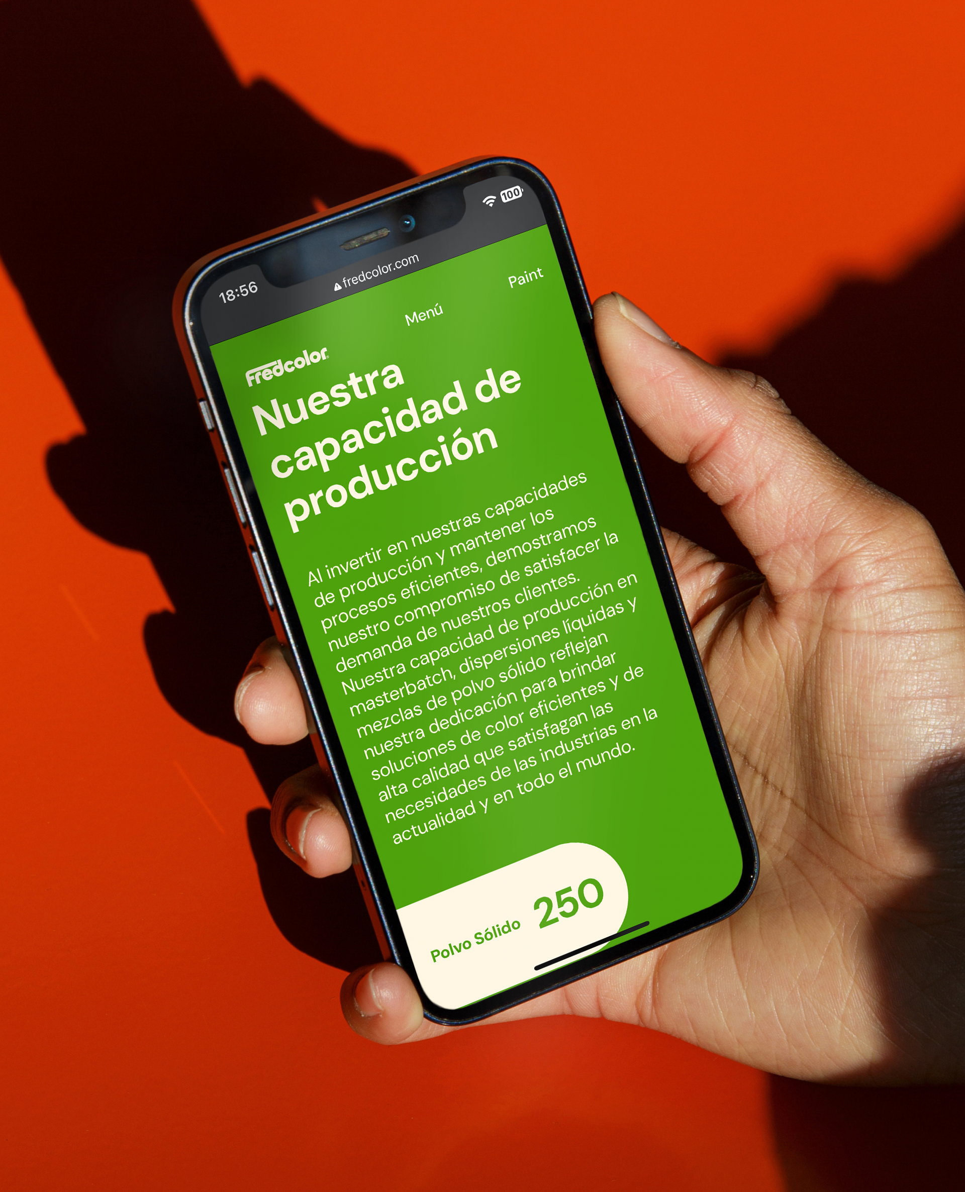
Immersing myself in Fredcolor’s craft was essential for shaping an effective content strategy. I spent over two months working closely with the team, capturing visuals and learning firsthand to create website content in three languages and establish a cohesive communication approach across all platforms.
For the website and content, I followed an iterative process—testing and refining every element to ensure clarity, precision, and alignment with Fredcolor’s brand voice.
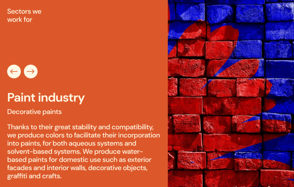
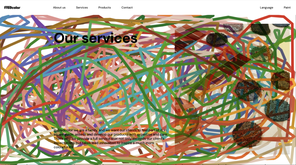
The identity is inspired by the Bauhaus era, with a simple, low-contrast, and immensely legible forms that are extremely adaptable across mediums.
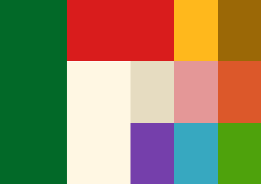
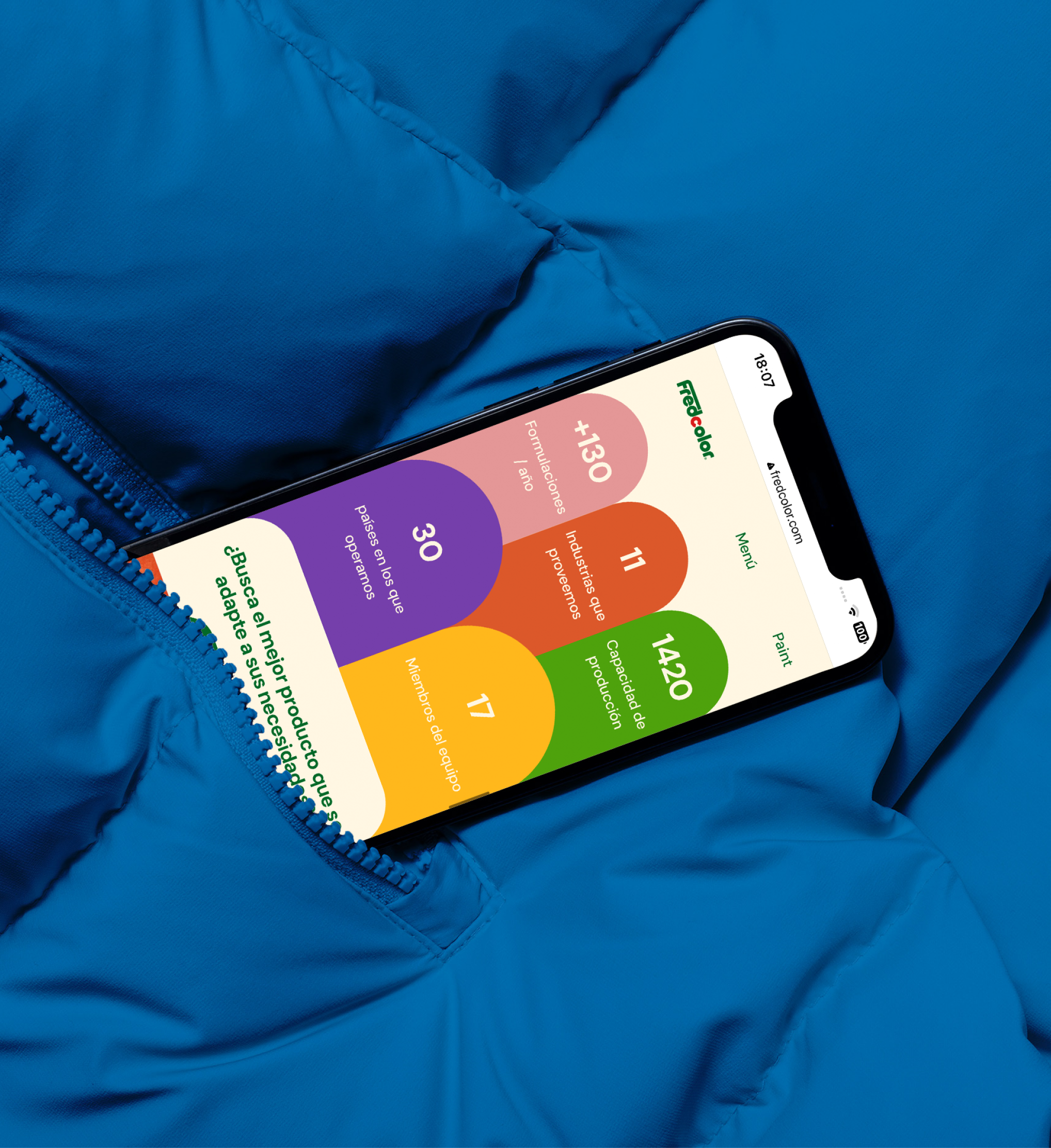
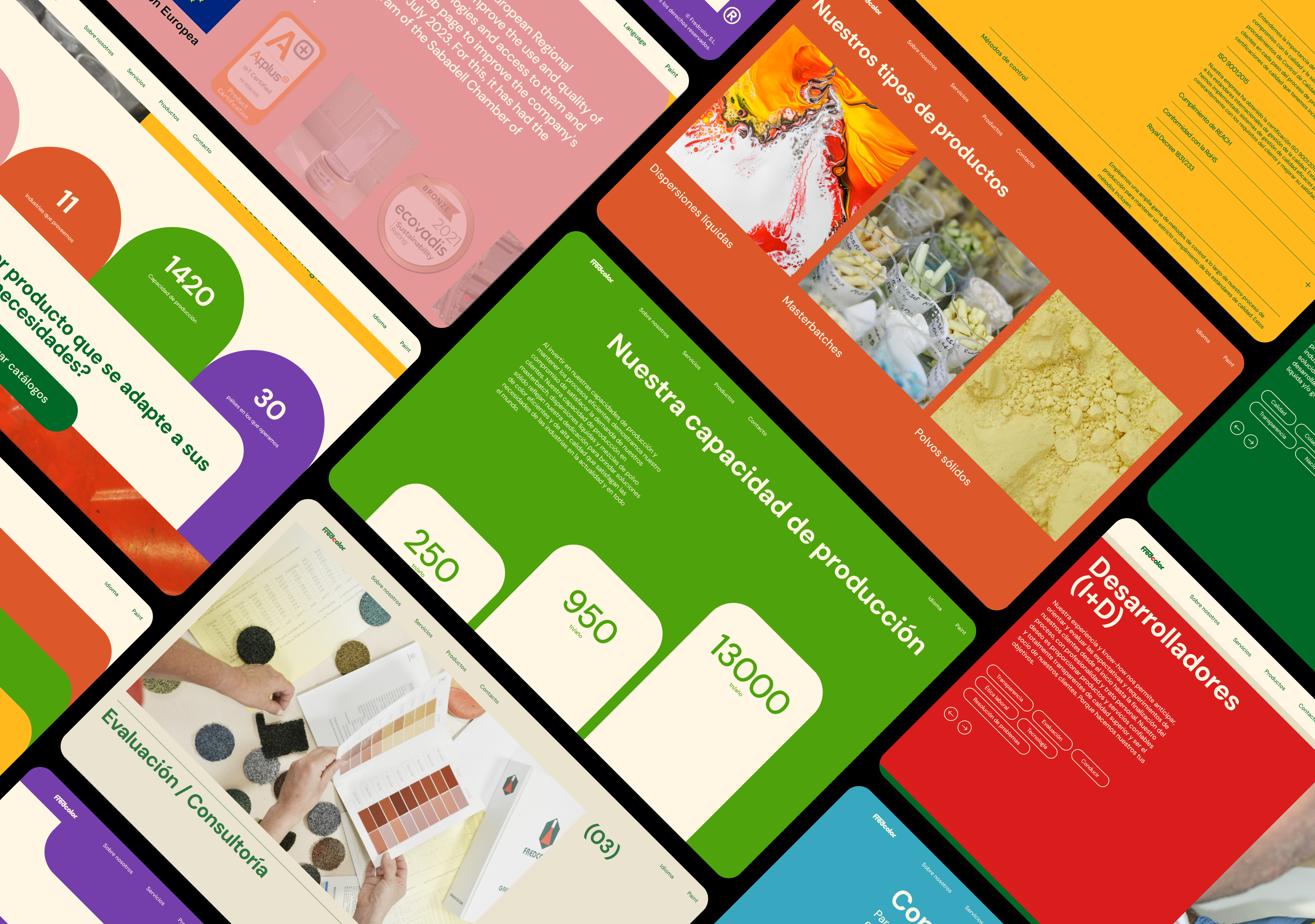
The color palette is vivid and talks about the brand form the get go. There are a total of 11 colors that are combined throughout.
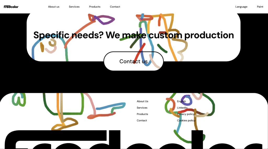
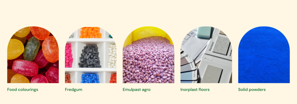
Round edges and circular shapes frame some of the images and define the shapes to create much more dynamic layouts and give an approachable look that reflect and reinforce the fact that Fredcolor is a family company.
Their whole product catalogs and are now reorganised and available to the user. The user can as well filter their different product types.
An interesting feature is the paint mode: when the paint mode is active the user can draw over the website and “play with color” themselves. This idea came in to celebrate the company’s aim and tagline “Making color yours” which emphasises on the fact that one of Fredcolor’s values is the development and production of tailored color solutions for their clients.
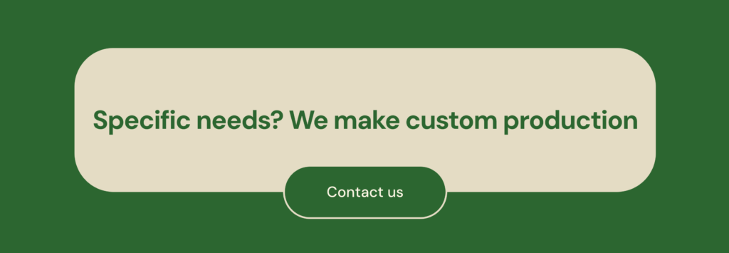
Three types of specific CTA modules are on display and repeated throughout in strategic points. These tackle three focal points: client acquisition (contact), increase the brand’s reputation (reviews), and create awareness of Fredcolor’s value.
Larger contact forms are hidden and ready to drop down on the mobile version to improve usability across devices.


coding and web development
Webcooking.